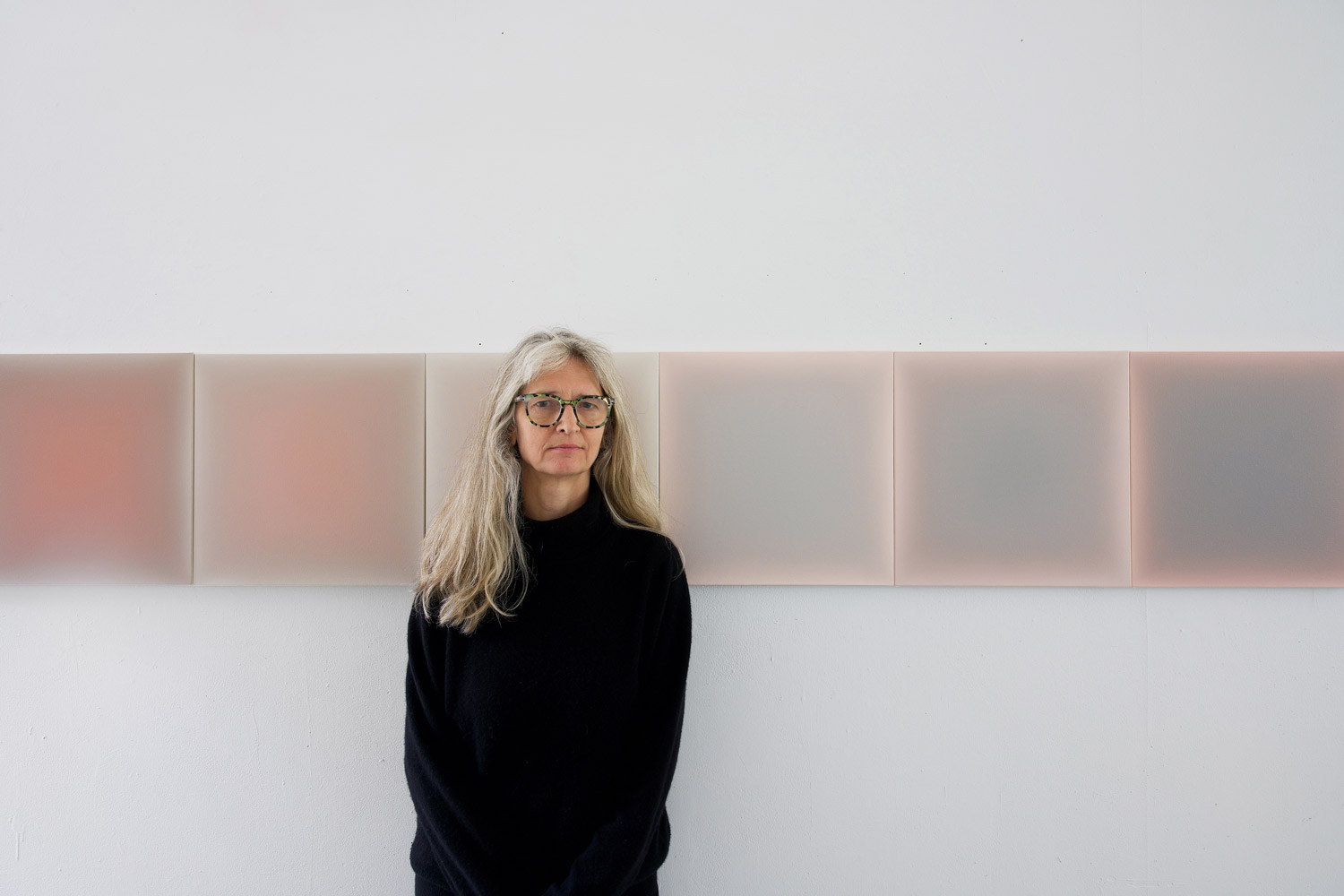
In the latest edition of our interview series, we once again dive into the world of minimalist aesthetics. In inspiring conversations with creative minds from the fields of architecture, design, and art, we explore how they are guided by their vision and how they express it in their works. Along the way, they provide us with interesting insights into their creative process and reveal how they perceive and shape the world. This time, I had the pleasure of having an inspiring conversation with Gwen Hardie.
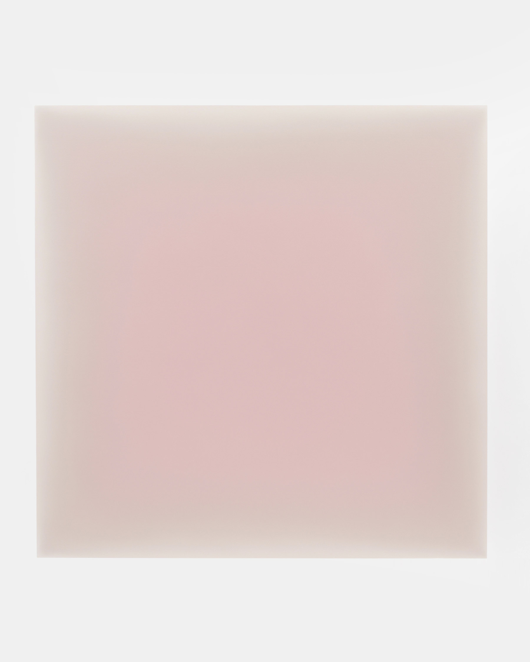
Gwen Hardie (b. 1962) is a Scottish-born, New York-based painter whose work is defined by soft, monochrome color fields and subtle gradients that evoke a meditative sense of depth and presence.
Hardie’s paintings are marked by a persistent curiosity about perception and the dynamic tension between fullness and emptiness. The result is a body of work that invites slow contemplation and offer viewers a rare aesthetic experience – moments suspended between light and shadow, presence and absence.
In this interview, I speak to Gwen on the formative moments and influences in her career, the evolution of her unique visual language, and the central role that intuition, color, and perception play in her process. She offers insight into her alchemical approach to painting, the influence of meditation, and how she creates sequences of works that unfold like visual journeys through light and time.
Gwen, thank you so much for your time today! You look back on a remarkable career spanning several decades. What have been the most formative moments and influences in your career as an artist so far? How has your unique visual language evolved over the years?
Life itself, consciousness, and the mysteries of the physical and non-physical are central to what I explore through my art. My early years at Edinburgh College of Art were formative: four years of studying the live model in sunlight taught me how color and tone create presence rather than narrative. I also drew great inspiration from artists like Gwen John, Morandi, and, later, Rothko’s Seagram paintings.
A key breakthrough came during my postgraduate year at 21, when I began magnifying the face and body on a large scale. Over the following decades, my practice shifted between observation-based painting and more reductive abstraction, such as my “Verge” series (2000–2003), which revolved around an imaginary horizon that hovered between visibility and disappearance. Later, from 2008 to 2018, I explored magnified portions of skin on the tondo format. I was intrigued by how color and tone could turn a flat surface into a sphere, imbuing it with a cosmic quality. Realizing that my palette drew heavily from my own skin tones, I expanded my color research across the full human spectrum.
In 2018, moving from circular to square formats opened up a new dynamic between foreground and background, leading me toward the direction I continue to develop today.
How would you describe your art to someone who has never seen it before? What themes or ideas do you explore in your art?
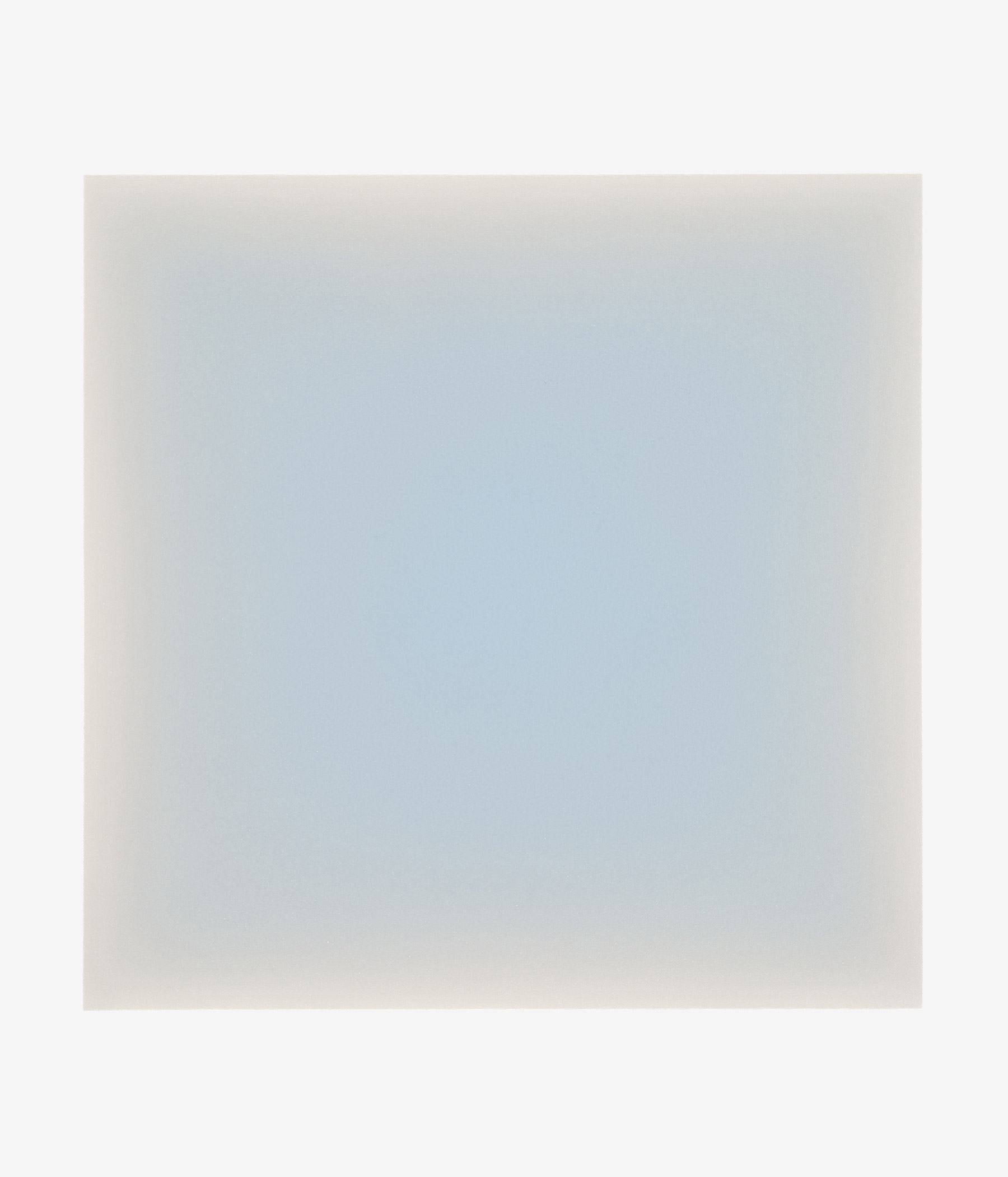
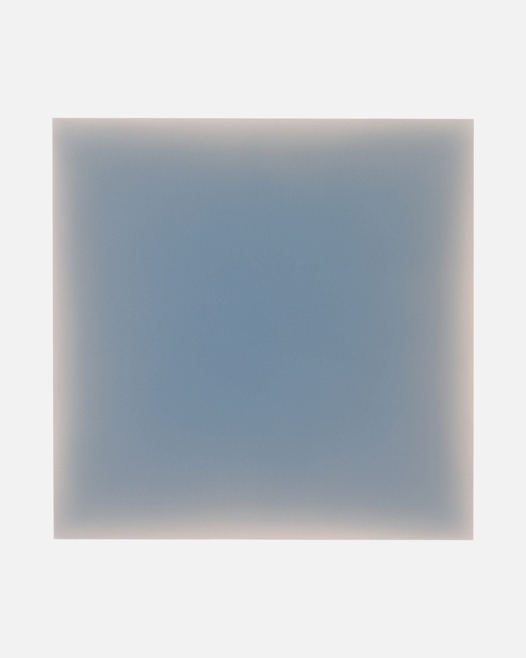
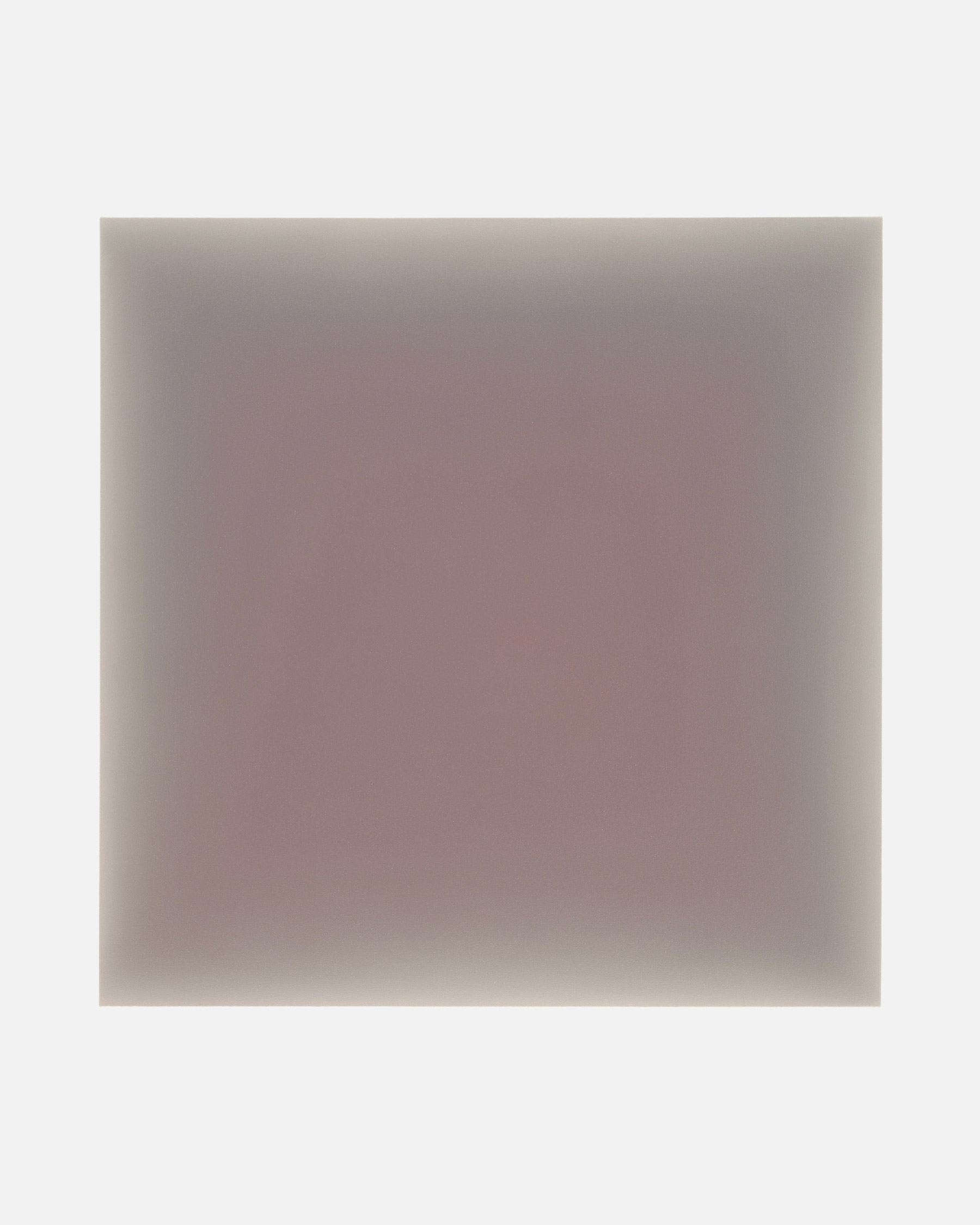
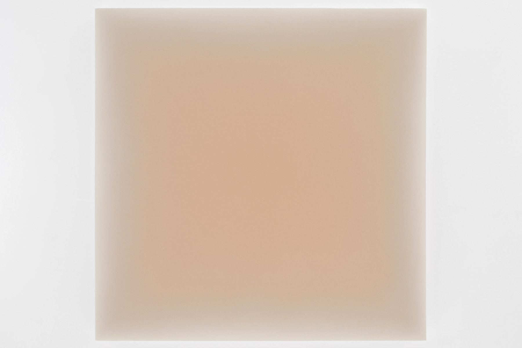
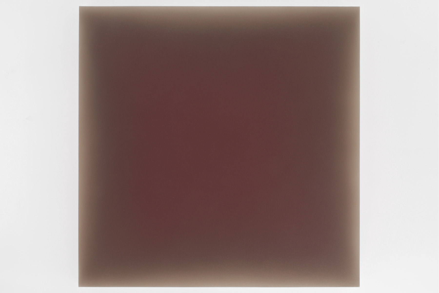
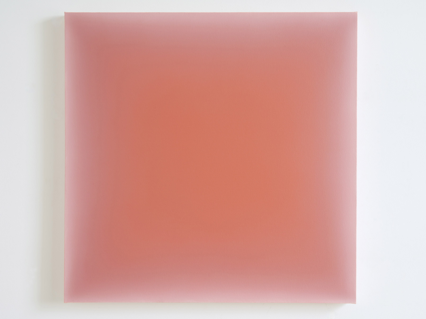
I would describe my art as animated fields of color that hold light and appear to be three-dimensional. The central themes in my work are the physical dimension of life, the non-physical dimension of light, and the passing of time.
Each of your color fields evokes a specific emotion or mood. Can you tell us more about how your own emotional world influences your choice of colors?
This question intrigues me; I think of how light reveals itself through a color. The extent to which I want a color to radiate or appear muted might be connected to an emotion – though I am not consciously driven by this. Rather, I am tapping into a curiosity and openness to experiment with colors and tones to see what happens perceptually. When the paintings are seen on their own, they exert a kind of magnetic pull inwards and also an expansiveness outwards – so they engage more through sense-based perceptions rather than emotions – though of course emotions are a vital part of such phenomena.
One painting triggers the desire for another painting in relation to it, so the choice of colors is relational. When shown as sequences, this dynamic conversation between paintings creates a movement which – coincidentally – corresponds to the word ’emotion’ if you remove the ‘e’! Temperatures of colors fascinate me; how warmth evokes a sense of proximity and intimacy, coolness – a sense of spaciousness and distance.
Temperatures of colors fascinate me; how warmth evokes a sense of proximity and intimacy, coolness – a sense of spaciousness and distance.
Take us into your studio for a moment. I’ve read that the act of painting is very time-pressured, as the film of oil paint starts to stiffen at a certain point while blending. How does this time pressure affect your creative process and the decisions you make while painting, and what role do intuition, control, and letting go play for you?
Yes, the time pressure is intense due to this narrow window of blending time, and it forces me to paint very fast! I become efficient through exploring many variations through sequences, becoming – as I delve deeper – more adept and familiar with a particular family of colors and the possible interactions between them; it’s like ‘tuning in’.
There’s a moment reached, often after a struggle, where the interaction between foreground and background color has an unexpected resolution. It’s that extra step beyond the preconceived that drives me and is so exciting. Intuition, control, and letting go are all essential components, so thank you for asking about them. At times one is more dominant, but they all play a vital role in the act of painting. Intuition leads me to a particular coloration at the outset of a painting and throughout the painting process as I discover how specific colors react to each other. Intuition also gives a sense that the painting is working or not – my years of working with tonal values and colors mean that I can control effects of light and color quite easily – in fact, control is not something I am aware of.
‘Letting go’ happens when a surprise reaction between colors starts to occur that I didn’t anticipate, and I let the discovery dictate the next steps towards resolution, or letting go can also mean simply that the painting is finished!
Emptiness and fullness seem to coexist equally in your paintings. In what ways do your earlier experiences with (Zen) Buddhism and your meditation practice still influence your work today?
Thank you! I love that you see this polarity! Indeed, the Heart Sutra on form and emptiness is one of my favorite ancient texts in Buddhism. The idea of form and emptiness has always rung true to me – like an essential paradox to our lives. My early experience with meditation offered a way into becoming more fully aware of the present and experiencing a deeper connection to the natural world – even if it caused me to realize that everything (including myself) is actually unfixed and constantly changing.
In these early days, I tried in my paintings to evoke single-pointedness in the mindfulness of breathing practice. In hindsight, this work was problematic, as it stayed on the level of illustrating an idea rather than embodying it. Now, I seek to create an actual perceptual experience around how the color lives in the painting – both between grounds and in the way that the human eye perceives it. The energy between colors and the illusion of light causes a kind of internal ‘happening’ in the present, which I feel is more successful.
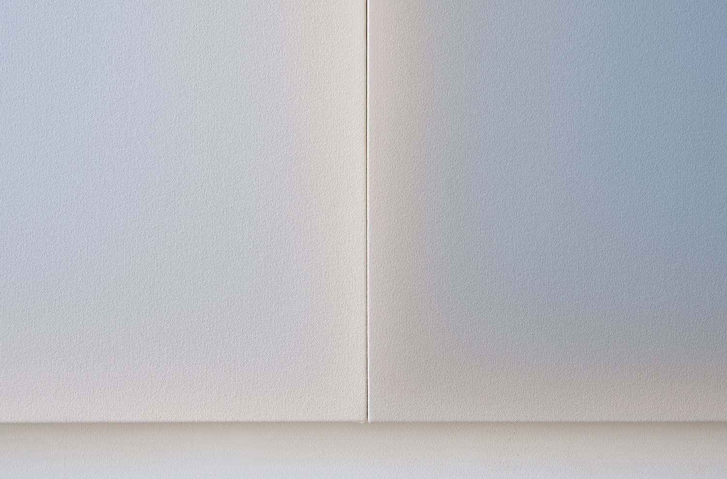
It’s interesting that you bring up this idea of fullness and emptiness in coexistence. I think this sense of emptiness comes not only from the fact that there’s no details to focus on – but that the transitional ‘walls’ between grounds seem to create a kind of physical framing, anchoring, and assertiveness of this emptiness – however subtle. Correspondingly, the sense of fullness comes from the illusion of expanding space that arises from these transitional walls. This is a natural evolution of my roots in magnifying the subject beyond all recognition so that the visual field feels alive.
In an interview, you once spoke of a “sweet spot” – the moment of satisfaction when you finish a painting. What exactly characterizes this moment for you?
The absence of an urge to keep changing it! Sometimes I feel like I am begging for that urge to stop and my poor body has to just keep painting. Eventually, I find the particular aliveness, tension, and subtlety I was reaching for. Always, there is a kind of holding of light – as if the light is passing through the physical object of the painting. I need to be convinced that there’s a holding together of physical and nonphysical elements in the painting.
You describe the process of creating your paintings as a kind of “alchemical process.” What role does the viewer play in this for you? In your view, does the magic of the work unfold fully only when it is perceived by someone else?
The magic has to unfold with me first because this is how I become convinced by it. It’s an added source of joy and surprise when others experience something like what I was trying to convey. I consider the alchemical process to be the transformation from the flat object of the canvas to the three-dimensional illusion that contains light. I want to offer that direct visceral and perceptual alchemy to the viewer as they look from edge to center – so, in a sense, yes, direct human perception completes the process.
Intuition leads me to a particular coloration at the outset of a painting and throughout the painting process as I discover how specific colors react to each other.
And finally: What are you working on right now, and what are your plans for the future? Are there currently any artistic challenges that inspire you?
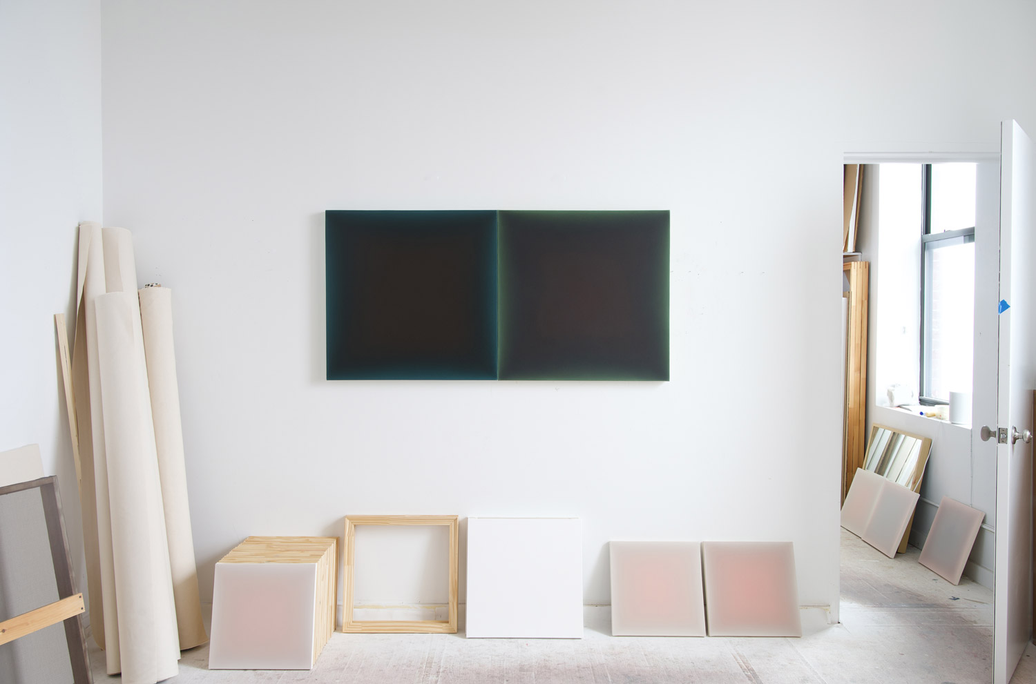
What’s surprising to me is how sequences of paintings have been developing – both creatively in my studio and as a new way to show and sell my work. I recently created three new sequences at Yaddo – the renowned artist residency in Saratoga Springs (August 2025). The new challenge here was that I conceptualized from the outset a purpose for bringing the paintings together in sequence. Each one consists of a sequence of eight to ten paintings in a tight row, edge to edge.
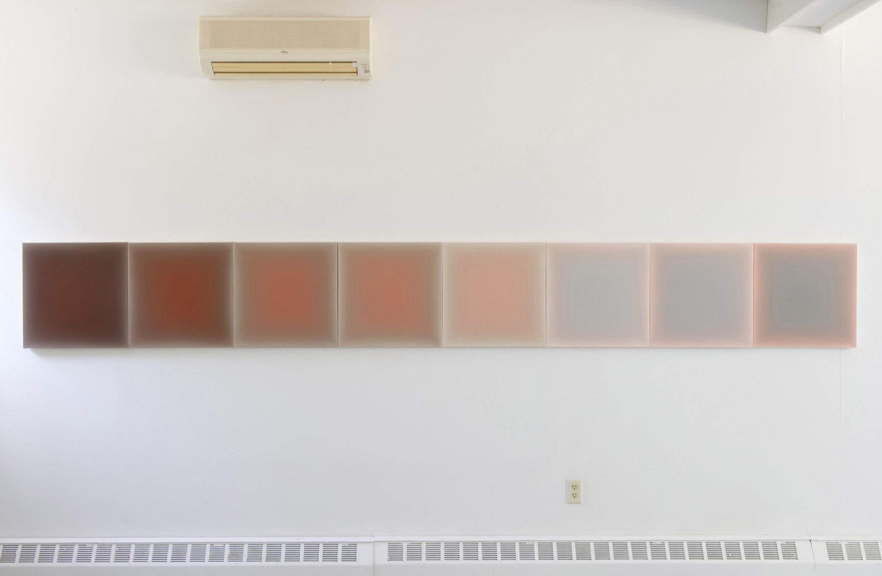
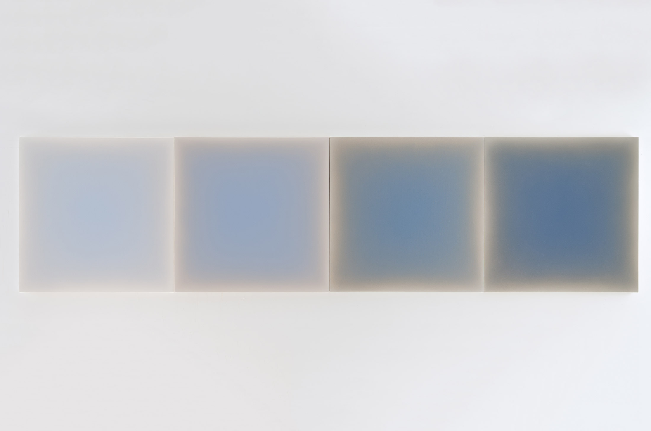
Two sequences, titled “Arc of the Sun – Venetian Red”, are variations on the concept of a grand sweep of light from sunrise to sunset, which play out through the gradations of tone and color saturations in each painting. I chose Venetian red as the subject, which is determined by these different light conditions as the earth moves around the sun – so for example the red is very saturated in the midday sun (in the middle of the sequence) and desaturates as the day approaches night (towards the end of the sequence). Each painting represents a kind of holding station of light, a pause in the arc of the sun.
The third sequence, “Light in the forest,” is inspired by a daily walk through the forest at Yaddo, amongst infinite varieties of the color green. The challenge with this was to work with green foregrounds – a coloration that I have not studied before.
Back in my Brooklyn studio now, I am working on new sequences on a larger scale. I just completed a sequence of four 30-inch squares that explores light through Cobalt Blue. This sequence will be shown together with “Arc of the Sun – Venetian Red” , a sequence of ten 16-inch paintings at the “UNTITLED” Art Fair, Miami Beach this coming Dec 3-7, 2025 with Arden + White. The venue is steps from the ocean and flooded with sunlight from above – which will illuminate the paintings perfectly.
My upcoming solo show in San Francisco with Dolby Chadwick in April 2026 will present a larger spectrum of colorations and sizes in various sequences of two, three, four, and eight, and also solo paintings. We have already designated the wall for “Arc of the Sun – Venetian Red”, (the sequence of eight 20-inch square paintings). This wall is at right angles to massive windows the entire length of the Gallery – so there’s a constantly changing quality of light that will engage with the movement of light through the paintings.
Thank you so much, Gwen!