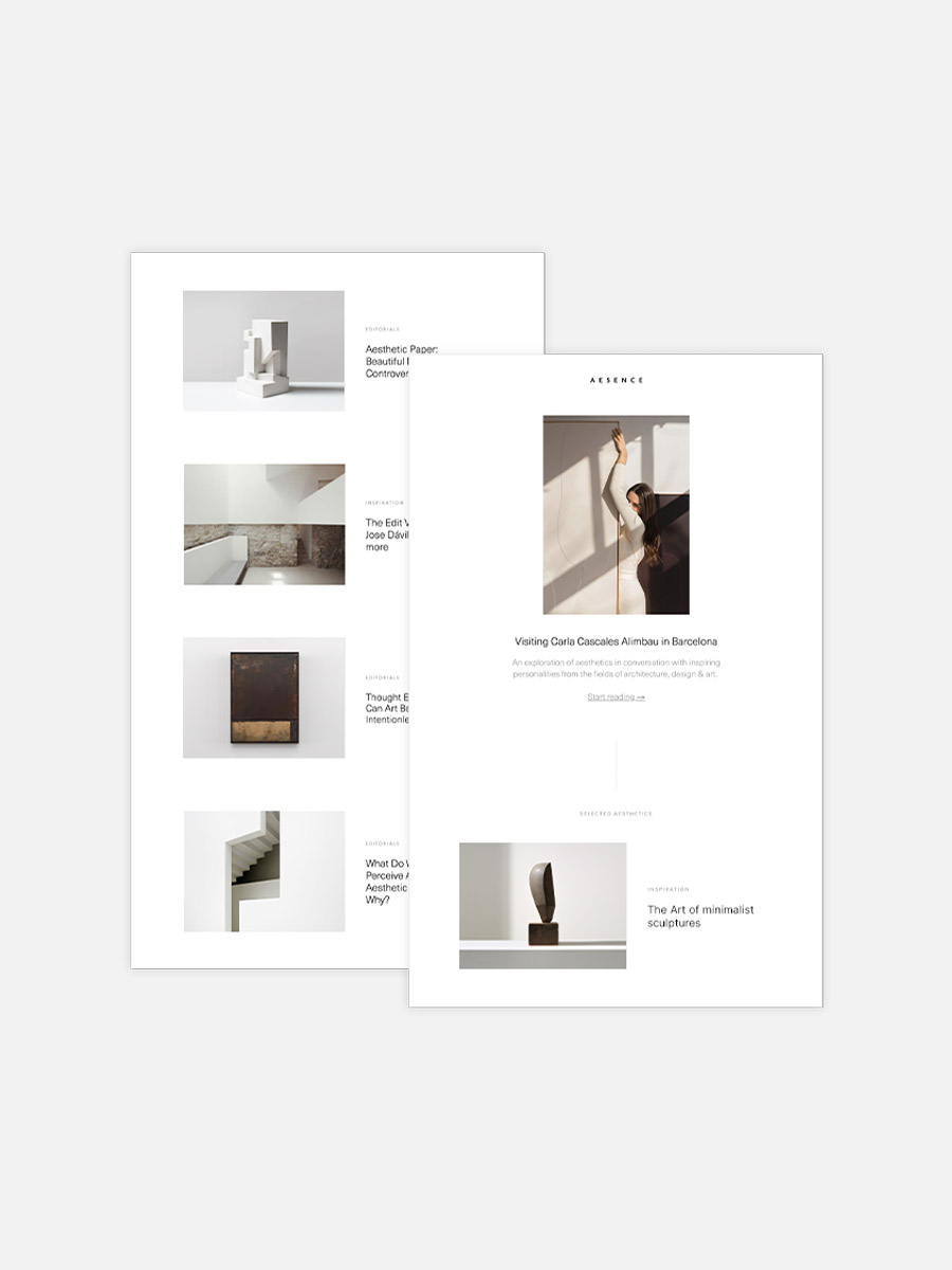
In the latest edition of our interview series, we once again dive into the world of minimalist aesthetics. In inspiring conversations with creative minds from the fields of architecture, design, and art, we explore how they are guided by their vision and how they express it in their works. Along the way, they provide us with interesting insights into their creative process and reveal how they perceive and shape the world. This time, I had the pleasure of having an inspiring conversation with Krista Mezzadri.
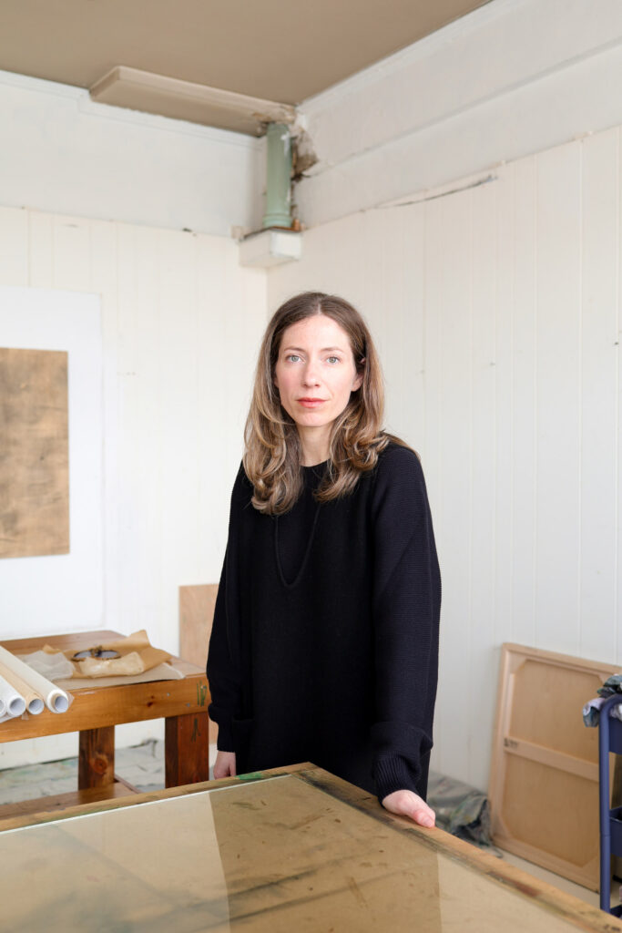
Krista Mezzadri (b. 1987, Dayton, Ohio) is an American artist based in Buffalo, New York, whose practice explores the dynamic coexistence of opposites. Through an intuitive approach to monotype printmaking, she creates layered compositions from Japanese washi, overlapping translucent sheets to assemble intricate, rhythmic patterns.
In this interview, Krista shares insights into her artistic journey, from her beginnings in watercolor to her innovative printmaking techniques, and discusses her fascination with physical and conceptual contrasts. She also talks about her creative motivations and plans for future work.
Krista, thank you for your time today! Please tell us, how did you get into art? Did you always know that you wanted to be an artist?
The short answer is no, I didn’t always know. But creativity was always present. I was very involved with the arts as a child, and making things has always felt like an essential part of who I am. Still, it wasn’t until later as an adult that I realized being an artist was something I needed to fully integrate into my life.
I began my undergraduate studies in fine art, but ultimately earned a business degree for practical reasons. Happily, I was able to continue some art coursework, and over time I developed a consistent self-taught practice on the side. Years later, after the birth of my first child, it became clear that this was how I needed to live. Something about becoming a mother pushed me to become the truest version of myself, for my daughter. I think that’s a common turning point for many new parents.
How has your work developed over the years? Were there certain phases or turning points that had a strong influence on you? And what led you to the technique you use today?
For many years, watercolor was my main medium. Eventually, though, I felt a strong urge to move beyond it, to explore other modes of expression. Around that time, I began noticing monotype printmaking everywhere. It felt like synchronicity. I’ve been working in printmaking now for about six years and truly love it.
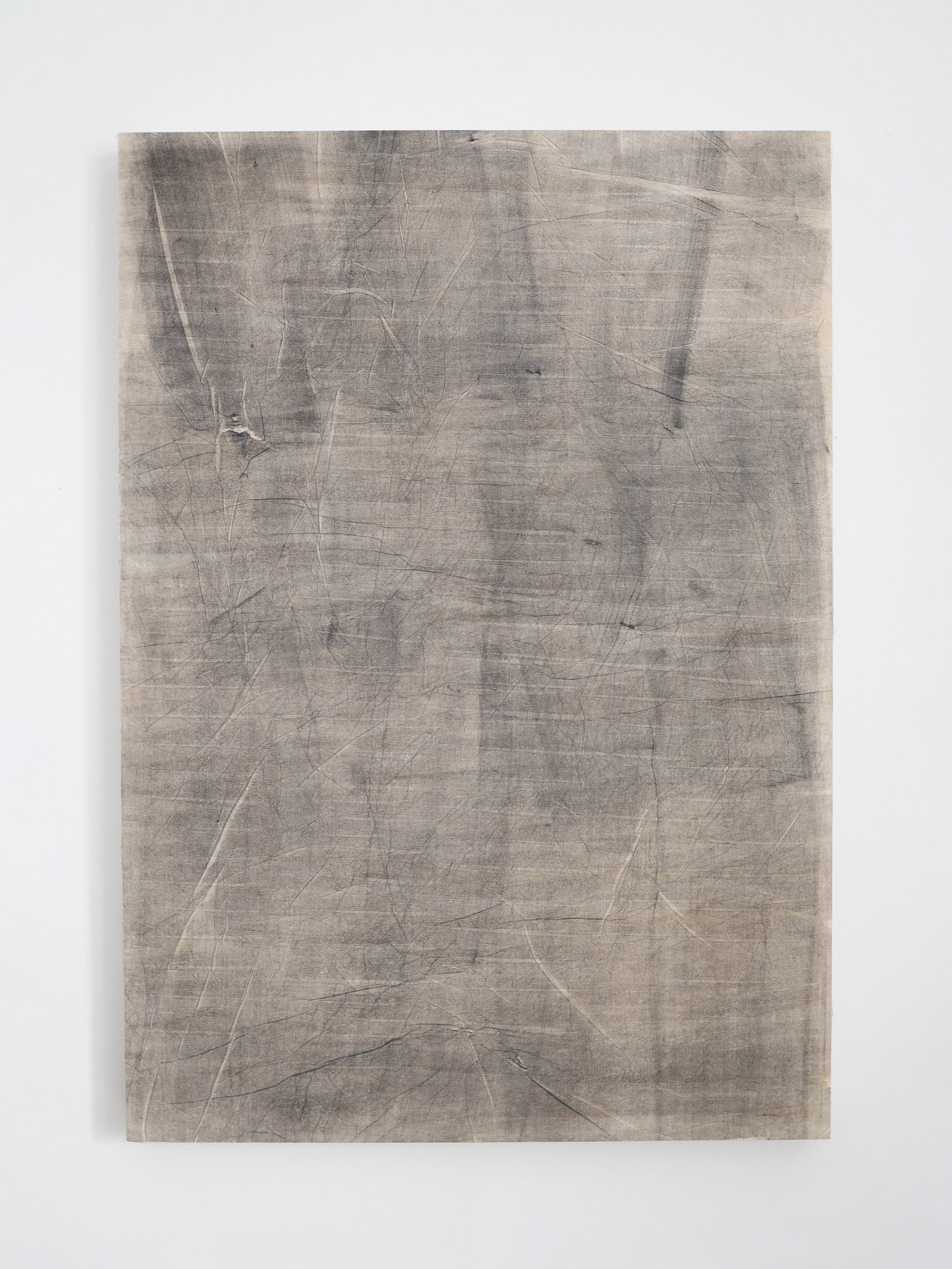
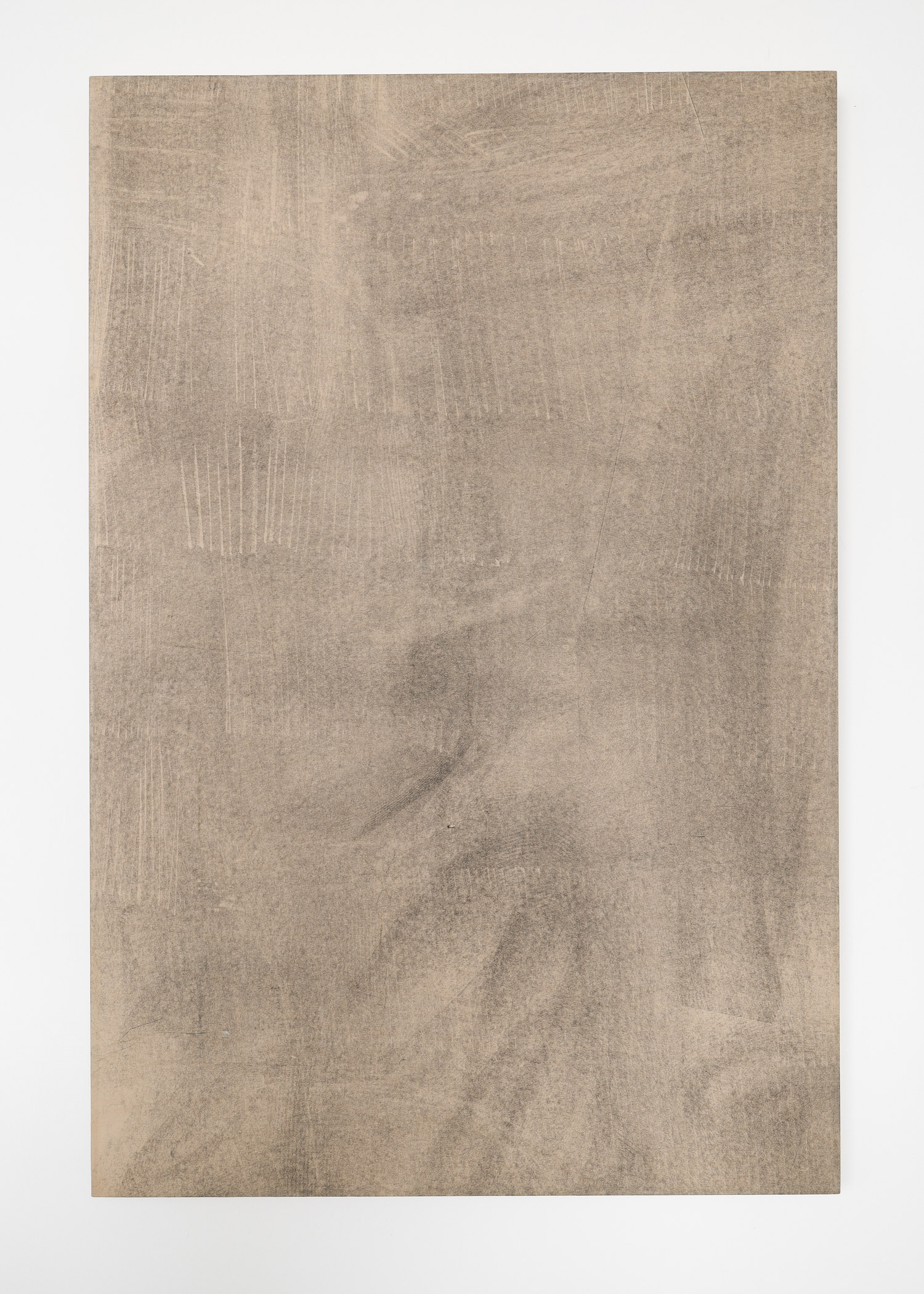
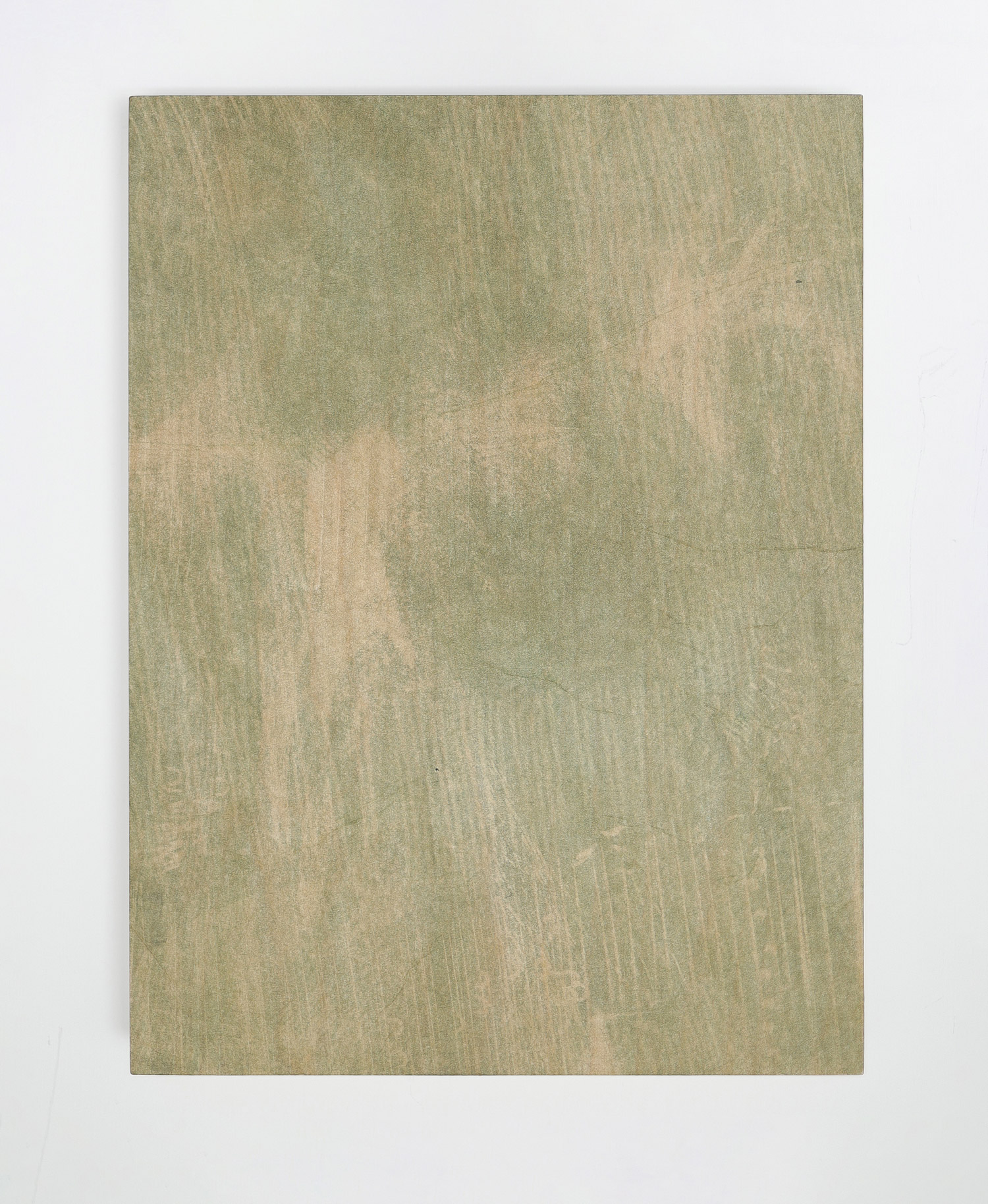
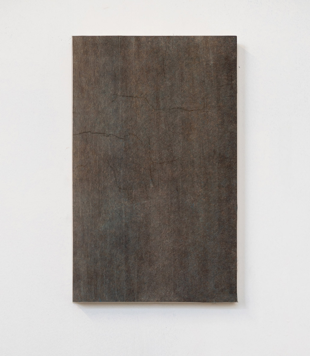
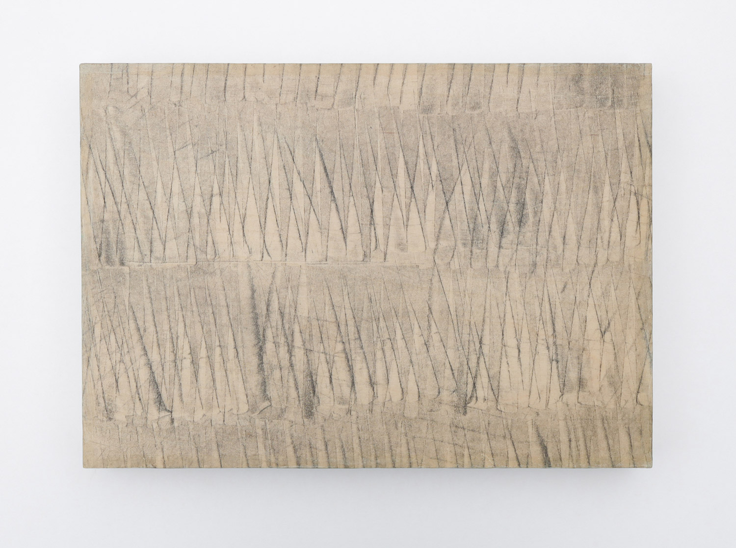
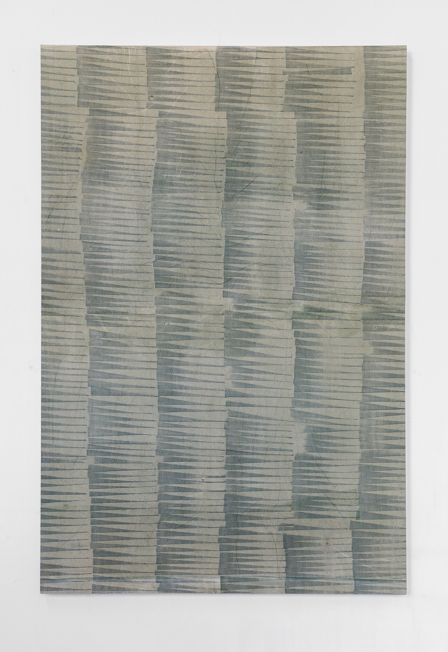
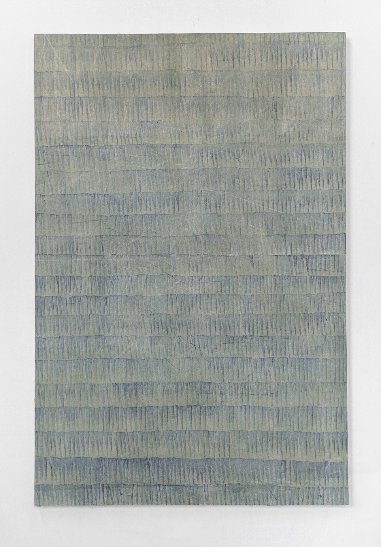
When I started, I remained focused on translucency, a carry-over from my watercolor practice. I kept to single colors and a flat visual plane, using stencils and a baren hand press to make monotypes. As I kept working, I began to crave more spontaneity, which led me to reductive, or “dark field”, monotype printmaking. In this approach, I ink the plate and remove areas with squeegee tools, playing with negative space. The triangular patterns in my work actually came out of that sweeping, gestural movement of my wrist during that process, rather than any effort to include geometric shape.
At some point I wondered what would happen if I layered printed colors individually on paper rather than over each other in ink, like some sort of transparent collage. I experimented with carbon black on tissue paper, layering one sheet at a time and letting the overlaps shift the visual outcome. Using only black ink for a while let me focus on line, irregularity, and the relationships between forms. I started reintroducing color slowly after that.
Incorporating multiple techniques is important to me, but I’m also always thinking about how to simplify and keep things balanced and open-ended. I’ll add, I believe that growing in technique and expression as an artist means assessing which creative “points” make a good spot from which to branch out. My technique continues to develop because I reassess what I’m doing, what I’m communicating, where I can challenge myself, and of course what ideas need to be left behind.
You engage with the coexistence of opposites – what fascinates you about this and how do you explore it in your work?
I feel beauty exists with some degree of irregularity, imperfection, or even a hint of “ugliness,” depending on how you define it. In the studio, I ask myself, Is there enough “off” here? If a piece feels too perfect, I’m usually not satisfied. That awareness of tension in visual opposites naturally leads me to explore other kinds of contrast as well, like light and shadow, softness and hardness, or fragility and structure.
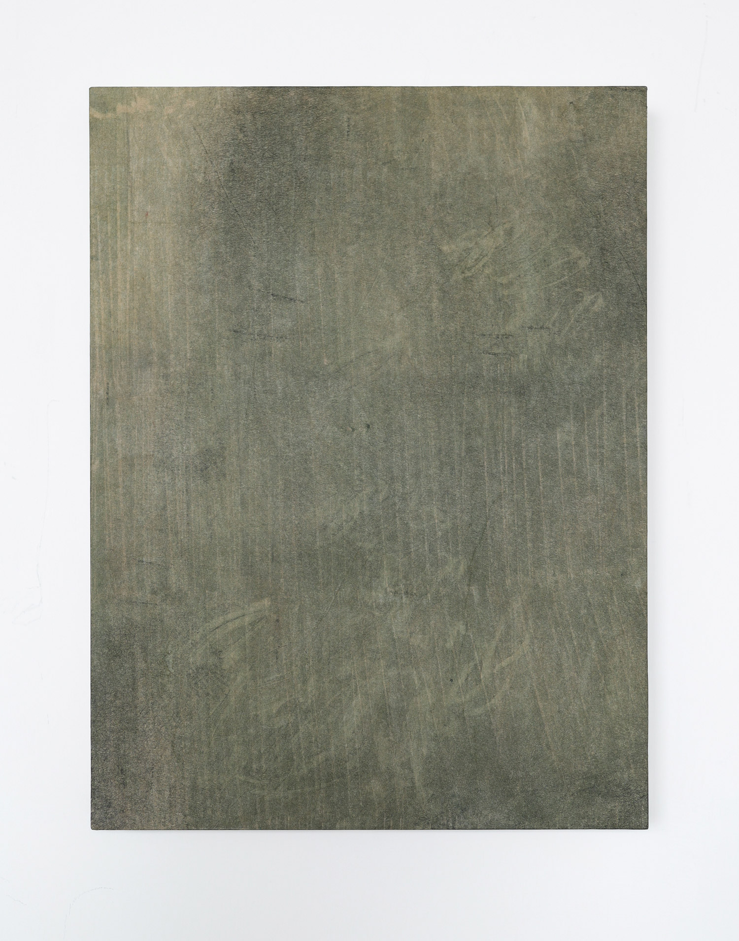
These contrasts show up in my materials too. There’s light within the fibers of the paper I use, but it’s gone once the layers are pasted down. The final surface of the work is flat and matte. But depending on the angle of view, the thin buildup of paper fibers shifts the density of what you see. That subtle interplay has become an important part of the work. So, I consider contrast in obvious ways, and not so obvious, but my approach is more instinctive with the way I work and less about the message of a piece.
Please take us into your studio. Can you walk us through your process, from the carbon black prints to drying and assembling the sheets? How much space do you give to spontaneity and intuition?
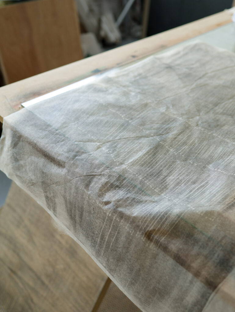
I’m lucky to have a good-sized studio with big windows and lots of gloomy northeast light. I work on a large glass slab matrix, where I roll out a thin layer of etching ink. Then I lay transparent, silk-like tissue paper over the ink and press into it using a tool. This is the trace monotype technique.
I hand-print onto tengujo, an extremely thin but strong Japanese washi. I’ll print for weeks, building a collection of material before I begin composing the final pieces. The layering phase is the most intuitive part: once the prints are dry, I layer them together, visualizing the translucent composition, and laminate them onto wood panels using rice paste. Similar to collage, the final artwork is a sum of parts. But, unlike most collage work, my prints are full and intact sheets that span the panel substrate, and the variation comes from the top-down see-through effect.
Repetition has been an ongoing interest to me, as both the way to create dimensional movement and its prevalence in nature, but also my physical studio practice. Within that structure, I can always anticipate spontaneity since my hand is free and imperfect.
I feel beauty exists with some degree of irregularity, imperfection, or even a hint of “ugliness,” depending on how you define it.
Which part of your creative process do you enjoy the most, and why?
The back and forth between artistic exploration and problem-solving. This is especially the case because I am asking my materials to go beyond their boundaries. That challenge is really engaging and energizing. I’m always thinking, What happens if I try this? Materially, visually.
Art is always a dialogue between the artist and the viewer. What kind of dialogue do you wish to start?
I work to present a short moment of observation. Perhaps that same sense of wonder I have in my practice I can convey to the viewer. Not wonder as in “awe”, just simply noticing, looking closer. Curiosity is the remedy to so many ills humanity is facing, so, maybe my artworks can encourage that.
Curiosity is the remedy to so many ills humanity is facing, so, maybe my artworks can encourage that.
What are you currently working on, and what are your plans for the future? Are there any subjects that you’d like to explore further?
I’m leaning more fully into the breadth of what’s possible with monotype printmaking (especially since I’ll soon be welcoming a new large press into my studio!). While my work has centered on motif and pattern, I now feel ready to explore the looser, more painterly side of the monotype process. Having developed a strong relationship with this paper, I’m returning to earlier questions about how color behaves when interleaved with paper and stacked in layers.
I’m thinking about how the tiny differences in paper weight play a role in allowing just enough extra light to pass through, to subtly shift how the printed color underneath is perceived. Obviously, these shifts in material and color will bring some new elements to my messaging. Recently I’ve been using open acrylics, and the experience is more tactile and immediate than traditional printmaking ink. So all that is to say, going forward, I’m focusing on color, brushwork, and layering with a greater sense of emotive resonance.
Thank you so much, Krista!